Welcome to OGeek Q&A Community for programmer and developer-Open, Learning and Share
Welcome To Ask or Share your Answers For Others

Categories

0 votes
149 views
in Technique[技术] by (71.8m points)

qt - Long TabBar - adding a size and position indicator to reflect the presence of off-screen tabs

I have a tab bar with a stacklayout like the following:

Rectangle {
    id: rect
    height: 190
    anchors.right: parent.right
    anchors.left: parent.left
    color: "transparent"
    anchors.top: uniqueHandleText.bottom
    anchors.topMargin: 100
    TabBar {
        id: frame
        anchors.right: parent.right
        anchors.left: parent.left
        background: Rectangle {
                color: "#737373"
            }
        x: -hbar.position * width
        Repeater {
            model: wizard.categories

            TabButton {
                id: tabData
                property bool selected: false
                text: modelData.name
                width: 200
                font.pixelSize: 18
                contentItem: Text {
                    text: tabData.text
                    font: tabData.font
                    horizontalAlignment: Text.AlignHCenter
                    verticalAlignment: Text.AlignVCenter
                    elide: Text.ElideRight
                    wrapMode: Text.WordWrap
                    color: "#FFFFFF"
                }
                background: Rectangle {
                        implicitWidth: frame.width
                        implicitHeight: 180
                        opacity: enabled ? 1 : 0.3
                        color: tabData.checked ? "#BD9CBE": "#737373"
                    }
            }

        }
    }
    ScrollBar {
            id: hbar
            hoverEnabled: true
            active: hovered || pressed
            orientation: Qt.Horizontal
            size: rect.width / frame.width
            anchors.left: parent.left
            anchors.right: parent.right
            anchors.top: frame.bottom
        }
    Text {
        font.pixelSize: 18
        text: "Next"
        anchors.right: parent.right
        visible: frame.x != frame.width ? true: false
    }

    StackLayout {
        id: stack1
        anchors.left: parent.left
        anchors.right: parent.right
        anchors.top: frame.bottom
        currentIndex: frame.currentIndex
        Repeater {
            model: wizard.categories

            Item {
                id: homeTab

                    TabBar {
                        id: homeTabTab
                        anchors.right: parent.right
                        anchors.left: parent.left
                        anchors.top: parent.top
                        height: 180
                        background: Rectangle {
                            color: "#958096"
                        }
                        Repeater {
                            model: modelData.sub_categories
                            TabButton {
                                property bool selected: false
                                id: currentTab
                                text: modelData.name
                                width: 200
                                font.pixelSize: 18
                                background: Rectangle {
                                        implicitWidth: frame.width
                                        implicitHeight: 180
                                        opacity: enabled ? 1 : 0.3
                                        color: currentTab.checked ? "#958096": "#8D758E"
                                    }
                                contentItem: Text {
                                    text: currentTab.text
                                    font: currentTab.font
                                    horizontalAlignment: Text.AlignHCenter
                                    verticalAlignment: Text.AlignVCenter
                                    elide: Text.ElideRight
                                    wrapMode: Text.WordWrap
                                    color: "#FFFFFF"
                                    MouseArea {
                                        anchors.fill: parent
                                        onClicked: {
                                            if(currentTab.checked){
                                                currentTab.checked = false
                                            } else {
                                                currentTab.checked = true
                                            }
                                        }
                                        onDoubleClicked: {
                                            currentTab.selected = true
                                            var found = false;
                                            var someText = frame.itemAt(stack1.currentIndex).text;
                                            print(someText)
                                            for(var i = 0; i<wizard.selectedSkills.count; i++){
                                                if(wizard.selectedSkills.get(i).name === someText){
                                                    wizard.selectedSkills.get(i).sub_categories.append({"name":currentTab.text});
                                                    wizard.skills.push({"name": someText})
                                                    found = true;
                                                }
                                            }
                                            if(!found){
                                                print(currentTab.text)
                                                wizard.selectedSkills.append({"name":someText, "sub_categories":[{"name":currentTab.text}]})
                                            }
                                            print(window.selectedSkills)
                                        }
                                    }
                                }

                            }
                        }
                    }
            }
            }
        }
}

I've tried many different things to add a scrollbar or to figure out how to use the flickable functionality that TabBar has. However, the documentation doesn't specify how it works, it just does. Therefore, they are not accessible (or even rewritteable, to use those properties). I want to add a small indicator like an arrow to specify that there is more elements for ease of navigation on desktop on top of the TabBar functionality.

See Question&Answers more detail:os

与恶龙缠斗过久,自身亦成为恶龙;凝视深渊过久,深渊将回以凝视…
Welcome To Ask or Share your Answers For Others

1 Reply

0 votes
by (71.8m points)

It doesn't seem like the necessary properties are exposed in order to make this happen the easy way.

However, since this is QML, it means the whole object tree is gaping wide open to introspection, allowing us to establish that the item that does the flicking is the contentItem of a ListView inside the Container the ToolBar inherits. The view happens to be the second visible child, although this is technically "private implementation" that one should not rely on. So it is better to take some extra care to establish whether or not you have the correct object.

ApplicationWindow {
  id: main
  width: 640
  height: 480
  visible: true

  TabBar {
    id: toolbar
    width: parent.width
    height: 50
    Repeater {
      model: 10
      TabButton {
        text: "test " + index
        width: 100
      }
    }
  }

  Rectangle {
    height: 5
    width: main.width * (view ? view.visibleArea.widthRatio : toolbar.width / toolbar.contentWidth)
    color: "red"
    anchors.top: toolbar.bottom
    x: view ? (main.width - width) * (view.contentX / (view.contentWidth - view.width)) : 0
  }

  property ListView view: {
    var l = toolbar.visibleChildren.length
    while (--l) if ("cacheBuffer" in toolbar.visibleChildren[l]) return toolbar.visibleChildren[l]
    return null
  }
}

And there you have it. We iterate the tabview children until we find one that has a property cacheBuffer which is fairly unique to ListView, and once we have that, we can access the needed properties. As you see, for the indicator width we can do even without the list view, as the toolbar exposes a contentWidth property, but for the indicator position there is no workaround.
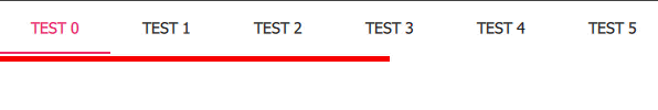
And it works:

enter image description here


与恶龙缠斗过久,自身亦成为恶龙;凝视深渊过久,深渊将回以凝视…
OGeek|极客中国-欢迎来到极客的世界,一个免费开放的程序员编程交流平台!开放,进步,分享!让技术改变生活,让极客改变未来! Welcome to OGeek Q&A Community for programmer and developer-Open, Learning and Share
Click Here to Ask a Question

...