Welcome to OGeek Q&A Community for programmer and developer-Open, Learning and Share
Welcome To Ask or Share your Answers For Others

Categories

0 votes
305 views
in Technique[技术] by (71.8m points)

html - CSS only solution to set MULTIPLE “same height” row sections on a responsive grid

Wanted: a CSS only solution to enable MULTIPLE equal height grid "sections" on a per row basis, that is also responsive.

Note: this is a follow-up question to this question which has only a single "equal height" section per item - which can be achieved through flexbox

The below diagram should help explain the requirement: Helpful Diagram

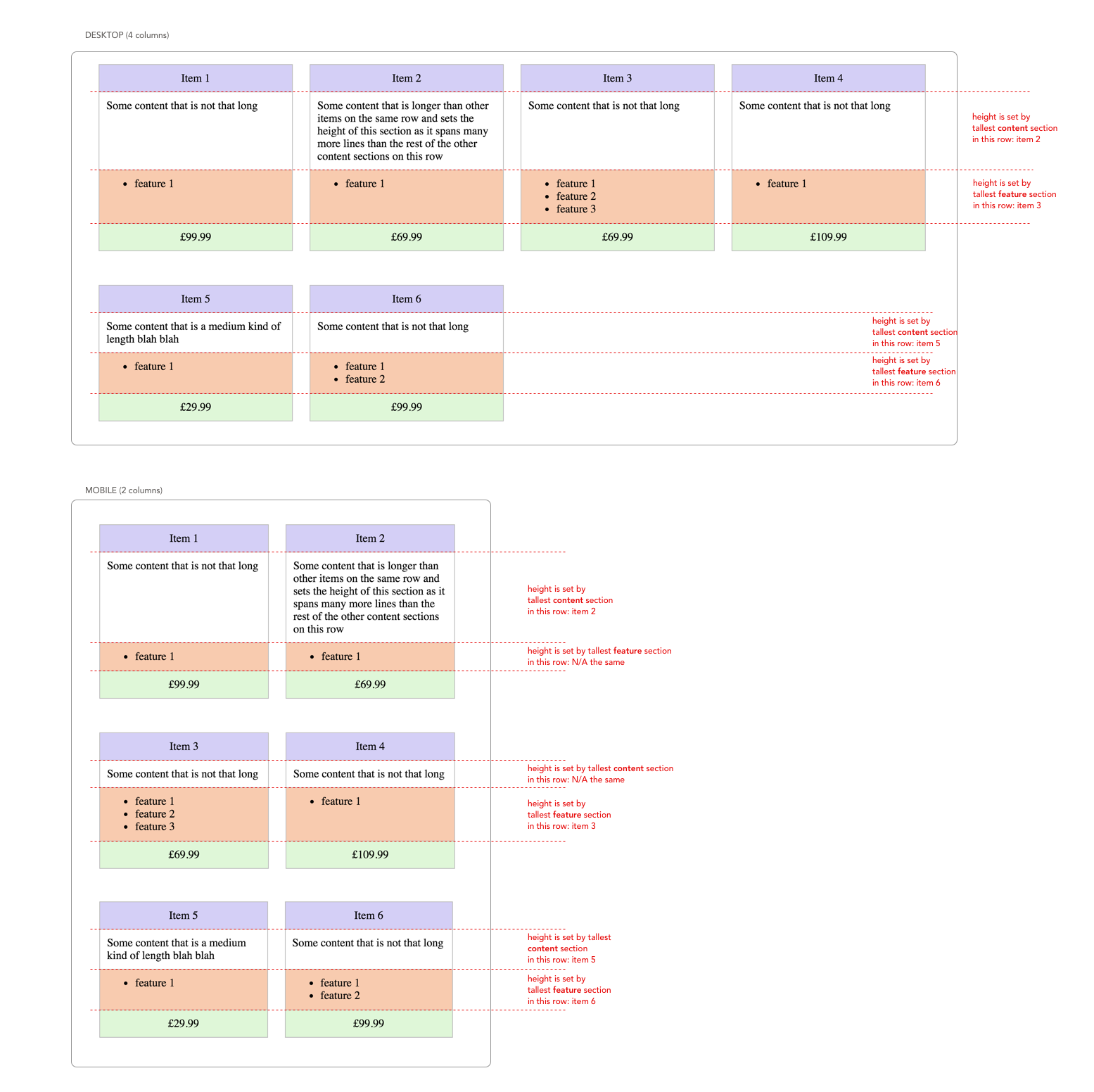
The "item grid" should be responsive - in that it can show a different number of cards per row based on viewport width (4 on desktop, 2 on mobile). Within a given row, the equivalent "content" and "feature" sections should have the same height.

In the below HTML & CSS - the item cards are split into the rows that we need (at the two example break points desktop & mobile) but the content section heights are variable:

.items {
  max-width: 1200px;
}

.item {
  width: 25%;
  box-sizing: border-box;
  display: inline-block;
  vertical-align: top;
  padding: 0 12px;
  margin: 24px -4px 24px 0;
}

@media (max-width: 600px) {
  .item {
    width: 50%;
  }
}

.item__heading {
  background-color: #d4d0f5;
  padding: 10px;
  text-align: center;
  border: 1px solid #bbbbbb;
}

.item__content {
  padding: 10px;
  border-left: 1px solid #bbbbbb;
  border-right: 1px solid #bbbbbb;
}

.item__features {
  padding: 10px;
  border-top: 1px solid #bbbbbb;
  border-left: 1px solid #bbbbbb;
  border-right: 1px solid #bbbbbb;
  background-color: #f7cbb1;
}

.item__features ul {
  margin: 0px;
}

.item__price {
  background-color: #e0f6d9;
  padding: 10px;
  text-align: center;
  border: 1px solid #bbbbbb;
}
<div class="items">

  <div class="item">
    <div class="item__heading">
      Item 1
    </div>
    <div class="item__content">
      Some content that is not that long
    </div>
    <div class="item__features">
      <ul>
        <li>feature 1</li>
      </ul>
    </div>
    <div class="item__price">
      £99.99
    </div>
  </div>


  <div class="item">
    <div class="item__heading">
      Item 2
    </div>
    <div class="item__content">
      Some content that is longer than other items on the same row and sets the height of this section as it spans many more lines than the rest of the other content sections on this row
    </div>
    <div class="item__features">
      <ul>
        <li>feature 1</li>
      </ul>
    </div>
    <div class="item__price">
      £69.99
    </div>
  </div>

  <div class="item">
    <div class="item__heading">
      Item 3
    </div>
    <div class="item__content">
      Some content that is not that long
    </div>
    <div class="item__features">
      <ul>
        <li>feature 1</li>                         <li>feature 2</li>
        <li>feature 3</li>
      </ul>
    </div>
    <div class="item__price">
      £69.99
    </div>
  </div>

  <div class="item">
    <div class="item__heading">
      Item 4
    </div>
    <div class="item__content">
      Some content that is not that long
    </div>
    <div class="item__features">
      <ul>
        <li>feature 1</li>
      </ul>
    </div>
    <div class="item__price">
      £109.99
    </div>
  </div>

  <div class="item">
    <div class="item__heading">
      Item 5
    </div>
    <div class="item__content">
      Some content that is a medium kind of length blah blah
    </div>
    <div class="item__features">
      <ul>
        <li>feature 1</li>
      </ul>
    </div>
    <div class="item__price">
      £29.99
    </div>
  </div>

  <div class="item">
    <div class="item__heading">
      Item 6
    </div>
    <div class="item__content">
      Some content that is not that long
    </div>
    <div class="item__features">
      <ul>
        <li>feature 1</li>
        <li>feature 2</li>
      </ul>
    </div>
    <div class="item__price">
      £99.99
    </div>
  </div>

    
</div>
See Question&Answers more detail:os

与恶龙缠斗过久,自身亦成为恶龙;凝视深渊过久,深渊将回以凝视…
Welcome To Ask or Share your Answers For Others

1 Reply

0 votes
by (71.8m points)

Based on your own answer, where you grouped them by 4, you can do that with CSS Flexbox too.

To make them behave when there is less than 4, it might be possible to accomplish that using the nth-child selector, but it was simpler to use a last* class, so I went for the latter.

One might even be able to do this without the .group_of_4 wrapper, with some clever nth-child rules, but again, went for the simpler since it does not come with any obvious limitations

Fiddle demo

.items {
  display: flex;
  flex-direction: column;
  max-width: 1200px;
}

.items .group_of_4 {
  display: flex;
  flex-wrap: wrap;
  justify-content: space-between;        /*  updated  */
}

.items .group_of_4 ~ .group_of_4 {
  margin-top: 24px;
}

.items .group_of_4 > div {
  width: calc(25% - 12px);                /*  updated  */
  box-sizing: border-box;
  padding: 12px;
}


.item__heading {
  background-color: #d4d0f5;
  padding: 10px;
  text-align: center;
  border: 1px solid #bbbbbb;
  order: 1;
}

.item__content {
  padding: 10px;
  border-left: 1px solid #bbbbbb;
  border-right: 1px solid #bbbbbb;
  order: 2;
}

.item__features {
  padding: 10px;
  border-left: 1px solid #bbbbbb;
  border-right: 1px solid #bbbbbb;
  background-color: #f7cbb1;
  order: 3;
}

.item__price {
  background-color: #e0f6d9;
  padding: 10px;
  text-align: center;
  border: 1px solid #bbbbbb;
  order: 4;
}

/* one item in a group */
.items .group_of_4 .last1 {
    margin-right: calc(75%  6px);        /*  updated  */
}
/* two items in a group */
.items .group_of_4 .last2 {
    margin-right: calc(50% + 6px);       /*  updated  */
}
/* three items in a group */
.items .group_of_4 .last3 {
    margin-right: calc(25% + 6px);       /*  updated  */
}

@media (max-width: 600px) {
  .items .group_of_4 > div:nth-child(8) ~ .item__heading {
    margin-top: 24px;
    order: 5;
  }
  .items .group_of_4 > div:nth-child(8) ~ .item__content {
    order: 6;
  }
  .items .group_of_4 > div:nth-child(8) ~ .item__features {
    order: 7;
  }
  .items .group_of_4 > div:nth-child(8) ~ .item__price {
    order: 8;
  }
  
  .items .group_of_4 > div {
    width: calc(50% - 12px);             /*  updated  */
  }

  /* one item in a group */
  /* three items in a group */
  .items .group_of_4 .last1,
  .items .group_of_4 .last3 {
    margin-right: 50%;
  }
  /* two items in a group */
  .items .group_of_4 .last2 {
    margin-right: 0%;
  }  
}
<div class="items">

  <div class="group_of_4">
    <div class="item__heading">
      Item 1
    </div>
    <div class="item__content">
      Some content that is not that long
    </div>
    <div class="item__features">
      <ul>
        <li>feature 1</li>
      </ul>
    </div>
    <div class="item__price">
      £99.99
    </div>

    <div class="item__heading">
      Item 2
    </div>
    <div class="item__content">
      Some content that is longer than other items on the same row and sets the height of this section as it spans many more lines than the rest of the other content sections on this row
    </div>
    <div class="item__features">
      <ul>
        <li>feature 1</li>
      </ul>
    </div>
    <div class="item__price">
      £69.99
    </div>

    <div class="item__heading">
      Item 3
    </div>
    <div class="item__content">
      Some content that is not that long
    </div>
    <div class="item__features">
      <ul>
        <li>feature 1</li>
        <li>feature 2</li>
        <li>feature 3</li>
      </ul>
    </div>
    <div class="item__price">
      £69.99
    </div>

    <div class="item__heading">
      Item 4
    </div>
    <div class="item__content">
      Some content that is not that long
    </div>
    <div class="item__features">
      <ul>
        <li>feature 1</li>
      </ul>
    </div>
    <div class="item__price">
      £109.99
    </div>
  </div>
  
  
  <div class="group_of_4">
    <div class="item__heading">
      Item 5
    </div>
    <div class="item__content">
      Some content that is a medium kind of length blah blah
    </div>
    <div class="item__features">
      <ul>
        <li>feature 1</li>
      </ul>
    </div>
    <div class="item__price">
      £29.99
    </div>

    <div class="item__heading last2">
      Item 6
    </div>
    <div class="item__content last2">
      Some content that is not that long
    </div>
    <div class="item__features last2">
      <ul>
        <li>feature 1</li>
      </ul>
    </div>
    <div class="item__price last2">
      £99.99
    </div> 

  </div>
</div>

与恶龙缠斗过久,自身亦成为恶龙;凝视深渊过久,深渊将回以凝视…
OGeek|极客中国-欢迎来到极客的世界,一个免费开放的程序员编程交流平台!开放,进步,分享!让技术改变生活,让极客改变未来! Welcome to OGeek Q&A Community for programmer and developer-Open, Learning and Share
Click Here to Ask a Question

...