Welcome to OGeek Q&A Community for programmer and developer-Open, Learning and Share
Welcome To Ask or Share your Answers For Others

Categories

0 votes
446 views
in Technique[技术] by (71.8m points)

css - Creating an Isoceles Trapezoid shape

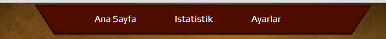
I'm wondering if I could produce something similar to this with CSS:

enter image description here

And I'm also wondering, is this the right place for such a question? I have not tried anything codewise, I've done the brown images with photoshop.

Thanks for any help !

See Question&Answers more detail:os

与恶龙缠斗过久,自身亦成为恶龙;凝视深渊过久,深渊将回以凝视…
Welcome To Ask or Share your Answers For Others

1 Reply

0 votes
by (71.8m points)

This shape (an Isoceles Trapezoid) can be easily made using CSS3 by rotating a div with a bit of perspective.

Explanation

  1. The shape is achieved by rotating an absolutely positioned pseudo-element (.container:after) along the x-axis with a perspective.
  2. We are not rotating the actual container div because it would cause the link (and any other) text inside it also to be rotated.
  3. Top border and an inset box shadow is used to mimick the shape exactly as shown in the figure in question. Top border produces the line with a lighter shade on top and the inset shadow produces the dark edges all around the shape.
  4. Since rotate transformations are not supported in lower versions of IE, the shape would not come in IE < 9. However, it would degrade gracefully into a rectangle shaped box in IE 8 and 9.
  5. IE 7 doesn't support pseudo-elements and hence in that even the box would not appear but the links would show up as-is. However, the same behavior as in IE 8/9 could be achieved by adding conditional CSS (add background and shadows to the container div) to target only IE 7.

body {
  font-family: Calibri;
  background: #5F4014;
}
.container {
  position: relative;
  width: 90%;
  text-align: center;
  margin: 50px 5px;
}
.container:after {
  position: absolute;
  content: '0a0';
  width: 100%;
  left: 10px;
  top: 0px;
  padding: 10px;
  background: #4F0D00;
  box-shadow: inset 0px 0px 10px 2px #340800;
  border-top: 1px solid #715E49;
  -webkit-transform: perspective(25px) rotateX(-3deg);
  -moz-transform: perspective(25px) rotateX(-3deg);
  transform: perspective(25px) rotateX(-3deg);
}
a {
  position: relative;
  display: inline-block;
  color: white;
  text-decoration: none;
  width: 100px;
  text-align: center;
  padding: 10px;
  z-index: 2;
}
a:hover {
  color: gold;
}
a:active {
  color: #ff6767;
}
<div class='container'>
  <a href='#'>Link 1</a>
  <a href='#'>Link 2</a>
  <a href='#'>Link 3</a>
  <a href='#'>Link 4</a>
</div>

与恶龙缠斗过久,自身亦成为恶龙;凝视深渊过久,深渊将回以凝视…
OGeek|极客中国-欢迎来到极客的世界,一个免费开放的程序员编程交流平台!开放,进步,分享!让技术改变生活,让极客改变未来! Welcome to OGeek Q&A Community for programmer and developer-Open, Learning and Share
Click Here to Ask a Question

...