Welcome to OGeek Q&A Community for programmer and developer-Open, Learning and Share
Welcome To Ask or Share your Answers For Others

Categories

0 votes
453 views
in Technique[技术] by (71.8m points)

xaml - WPF TabItem Header Styling

I'm trying to style a TabControl and have got 75% of the way there, but I'm having difficulty styling the actual TabItems:

enter image description here

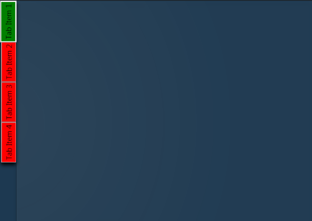
What I am trying to achieve is remove the default ContentPresenter so that I can make the tab items partially transparent with rounded edges instead of the place holder red and green i have now.

I'm sure it's probably not that difficult, but I just can't figure it out so any help would be most appreciated!

Here's the XAML for the TabControl so far:

<TabControl TabStripPlacement="Left" HorizontalAlignment="Stretch" BorderBrush="#41020202">
  <TabControl.BitmapEffect>
    <DropShadowBitmapEffect Color="Black" Direction="270"/>
  </TabControl.BitmapEffect>  
  <TabControl.Resources>    
    <Style TargetType="{x:Type TabItem}">
      <Setter Property="BorderThickness" Value="0"/>      
      <Setter Property="Padding" Value="0" />      
      <Setter Property="HeaderTemplate">        
        <Setter.Value>          
          <DataTemplate>        
            <Border x:Name="grid" Background="Red">
              <ContentPresenter>
                <ContentPresenter.Content>
                  <TextBlock Margin="4" FontSize="15" Text="{TemplateBinding Content}"/>
                </ContentPresenter.Content>             
                <ContentPresenter.LayoutTransform>                
                  <RotateTransform Angle="270" />              
                </ContentPresenter.LayoutTransform>            
              </ContentPresenter>  
            </Border>        
            <DataTemplate.Triggers>
              <DataTrigger Binding="{Binding RelativeSource={RelativeSource Mode=FindAncestor,AncestorType={x:Type TabItem}},Path=IsSelected}" Value="True">
                <Setter TargetName="grid" Property="Background" Value="Green"/>
              </DataTrigger>
            </DataTemplate.Triggers>
          </DataTemplate>        
        </Setter.Value>      
      </Setter>    
    </Style>  
  </TabControl.Resources>
  <TabControl.Background>
    <RadialGradientBrush Center="-0.047,0.553" GradientOrigin="-0.047,0.553" RadiusY="1.231" RadiusX="0.8">
      <GradientStop Offset="1" Color="#06FFFFFF"/>
      <GradientStop Color="#14FFFFFF"/>
    </RadialGradientBrush>
  </TabControl.Background>  
  <TabItem Header="Tab Item 1" />  
  <TabItem Header="Tab Item 2" />  
  <TabItem Header="Tab Item 3" />  
  <TabItem Header="Tab Item 4" />
</TabControl>
See Question&Answers more detail:os

与恶龙缠斗过久,自身亦成为恶龙;凝视深渊过久,深渊将回以凝视…
Welcome To Ask or Share your Answers For Others

1 Reply

0 votes
by (71.8m points)

Try this style instead, it modifies the template itself. In there you can change everything you need to transparent:

<Style TargetType="{x:Type TabItem}">
  <Setter Property="Template">
    <Setter.Value>
      <ControlTemplate TargetType="{x:Type TabItem}">
        <Grid>
          <Border Name="Border" Margin="0,0,0,0" Background="Transparent"
                  BorderBrush="Black" BorderThickness="1,1,1,1" CornerRadius="5">
            <ContentPresenter x:Name="ContentSite" VerticalAlignment="Center"
                              HorizontalAlignment="Center"
                              ContentSource="Header" Margin="12,2,12,2"
                              RecognizesAccessKey="True">
              <ContentPresenter.LayoutTransform>
            <RotateTransform Angle="270" />
          </ContentPresenter.LayoutTransform>
        </ContentPresenter>
          </Border>
        </Grid>
        <ControlTemplate.Triggers>
          <Trigger Property="IsSelected" Value="True">
            <Setter Property="Panel.ZIndex" Value="100" />
            <Setter TargetName="Border" Property="Background" Value="Red" />
            <Setter TargetName="Border" Property="BorderThickness" Value="1,1,1,0" />
          </Trigger>
          <Trigger Property="IsEnabled" Value="False">
            <Setter TargetName="Border" Property="Background" Value="DarkRed" />
            <Setter TargetName="Border" Property="BorderBrush" Value="Black" />
            <Setter Property="Foreground" Value="DarkGray" />
          </Trigger>
        </ControlTemplate.Triggers>
      </ControlTemplate>
    </Setter.Value>
  </Setter>
</Style>

与恶龙缠斗过久,自身亦成为恶龙;凝视深渊过久,深渊将回以凝视…
OGeek|极客中国-欢迎来到极客的世界,一个免费开放的程序员编程交流平台!开放,进步,分享!让技术改变生活,让极客改变未来! Welcome to OGeek Q&A Community for programmer and developer-Open, Learning and Share
Click Here to Ask a Question

1.4m articles

1.4m replys

5 comments

56.9k users

...