Welcome to OGeek Q&A Community for programmer and developer-Open, Learning and Share
Welcome To Ask or Share your Answers For Others

Categories

0 votes
480 views
in Technique[技术] by (71.8m points)

css - Is it possible to use display:block on td in HTML email, to achieve responsive table design?

This fantastic article describes how to create responsive tables which scale fabulously to mobile browsers.

Now I'm trying to apply the same technique to html emails but display:block just won't seem to work in html emails.

To reproduce the issue:

  1. Save the following code as an HTML page:

    <!DOCTYPE html PUBLIC "-//W3C//DTD XHTML 1.0 Transitional//EN" "http://www.w3.org/TR/xhtml1/DTD/xhtml1-transitional.dtd">
    <html>
    <head>
        <meta charset="utf-8">
        <style type="text/css">
            @media only screen and (max-width: 760px), screen and (max-device-width: 480px)  {
                /* Force table to not be like tables anymore */
                table, td, tbody, tr{
                        display: block;
                        width:100%;
                        padding:0;
                        clear:both;
                }
                td {
                        /* Behave  like a "row" */
                        position: relative !important;
                }
            }
        </style>
    </head>
    <body>
        <table style="width:100%;">
            <tr>
                <td style="border:1px solid red;">1/1</td>
                <td style="border:1px solid red;">1/2</td>
                <td style="border:1px solid red;">1/3</td>
            </tr>
            <tr>
                <td style="border:1px solid red;">2/1</td>
                <td style="border:1px solid red;">2/2</td>
                <td style="border:1px solid red;">2/3</td>
            </tr>
        </table>
    </body>
    </html>
    
  2. Open the page in Safari

  3. Resize the window to note how the table changes with a smaller window-size

  4. Press CMD+i or File->Mail Contents of this page to create a HTML email

  5. Resize the email window to note how the table still resizes correctly

  6. Send the email to yourself and open it.

  7. Now notice how the email indeed responds to the media query but unsuccessfully restyles the table.

I have yet to find an email client that actually displays the table correctly. Is this a dead-end or do you have ideas of workarounds?

See Question&Answers more detail:os

与恶龙缠斗过久,自身亦成为恶龙;凝视深渊过久,深渊将回以凝视…
Welcome To Ask or Share your Answers For Others

1 Reply

0 votes
by (71.8m points)

The accepted answer provides some great info but it doesn't address the question directly. I've been experimenting with responsive emails recently and have come up with some good solutions others might find useful. Here we go...

To answer the question, you can use display:block; to make table columns behave as rows on some mobile devices (Android, iOS and Kindle).

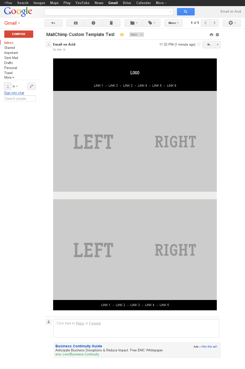
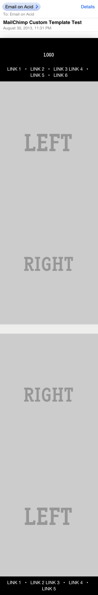
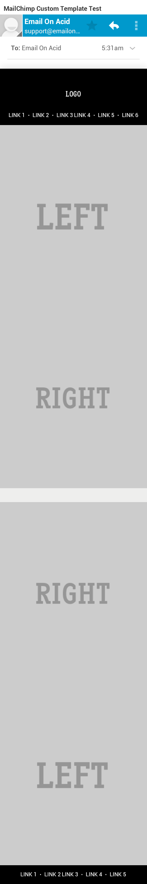
Here's an example showing how you would make a 2 column layout stack (left columns on top of right column) on mobile devices.

HTML

<table class="deviceWidth" width="100%" cellpadding="0" cellspacing="0" border="0" style="border-collapse: collapse; mso-table-lspace:0pt; mso-table-rspace:0pt; ">
  <tr>
    <td width="50%" align="right" class="full">
      <p style="mso-table-lspace:0;mso-table-rspace:0; padding:0; margin:0;">
        <a href="#"><img src="http://placehold.it/440x440&text=LEFT" alt="" border="0" style="display: block; width:100%; height:auto;" /></a>  
      </p>                  
    </td>
    <td width="50%" align="left" class="full">
        <a href="#"><img src="http://placehold.it/440x440&text=RIGHT" alt="" border="0" style="display: block; width:100%; height:auto;" /></a>                     
    </td>
  </tr>
</table>

CSS

@media only screen and (max-width: 640px)  {
    body[yahoo] .deviceWidth {width:440px!important; }  T 

    body[yahoo] .full {
        display:block;
        width:100%;
    }
}

Note: The body[yahoo] selector prevents Yahoo from rendering the media queries. The body element of my email has a yahoo="fix" attribute.

The above CSS says that if the screen is less than 640px in width then the tds with a class of full should display:block with width:100%.

Now, let's get a bit fancier. Sometimes you'll want the column on the left to stack BELOW the column on the right. To do this we can use dir="rtl" on the containing table to flip the order of the columns. The CSS stays the same, here's the new HTML:

HTML

<table class="deviceWidth" dir="rtl"  width="100%" cellpadding="0" cellspacing="0" border="0" style="border-collapse: collapse; mso-table-lspace:0pt; mso-table-rspace:0pt; ">
  <tr>
    <td width="50%" dir="ltr" align="right" class="full">
      <p style="mso-table-lspace:0;mso-table-rspace:0; padding:0; margin:0;">
        <a href="#"><img src="http://placehold.it/440x440&text=RIGHT" alt="" border="0" style="display: block; width:100%; height:auto;" /></a> 
      </p>                  
    </td>
    <td width="50%" dir="ltr" align="left" class="full">
        <a href="#"><img src="http://placehold.it/440x440&text=LEFT" alt="" border="0" style="display: block; width:100%; height:auto;" /></a>                      
    </td>
  </tr>
</table>

By adding the dir="rtl" we're telling it to reverse the order of the columns. The first column (in the flow of the HTML) is being displayed on the right, the second column (in the HTML) on the left. For screens smaller than 640px it displays the first column (the column on the right) first, and the second column (the column on the left) second.

Here's the full HTML and CSS and a screenshots from Gmail and iOS 5 are attached.

Gmail iOS 5 Android 4


与恶龙缠斗过久,自身亦成为恶龙;凝视深渊过久,深渊将回以凝视…
OGeek|极客中国-欢迎来到极客的世界,一个免费开放的程序员编程交流平台!开放,进步,分享!让技术改变生活,让极客改变未来! Welcome to OGeek Q&A Community for programmer and developer-Open, Learning and Share
Click Here to Ask a Question

...