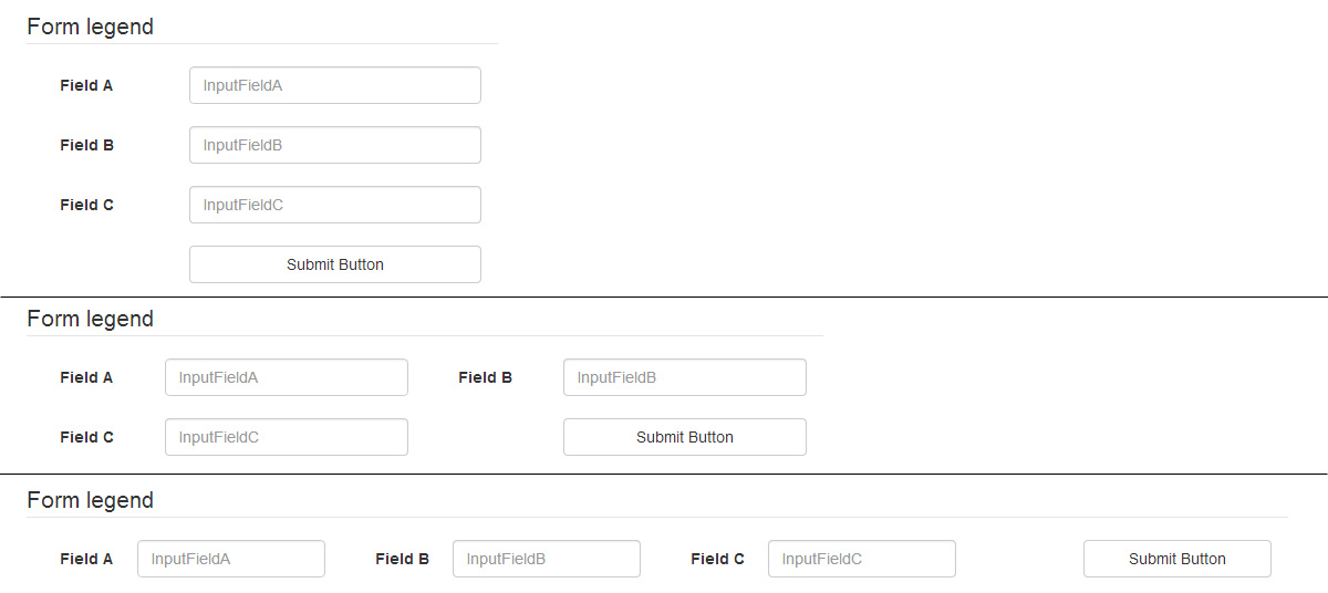
Option #1 : fixed columns
You can use a structure mixing col-xs-12, col-sm-6 and col-lg-3 to get 1, 2 or 4 columns. Inside your form-group, remember to fix label/input sizes with col-xs-4 and col-xs-8 :
<div class="container">
  <form class="form form-inline" role="form">

    <legend>Form legend</legend>

    <div class="form-group col-xs-12 col-sm-6 col-lg-3">
      <label for="InputFieldA" class="col-xs-4">Field A</label>
      <div class="col-xs-8">
        <input type="text" class="form-control" id="InputFieldA" placeholder="InputFieldA">
      </div>
    </div>

    <div class="form-group col-xs-12 col-sm-6 col-lg-3">
      <label for="InputFieldB" class="col-xs-4">Field B</label>
      <div class="col-xs-8">
        <input type="text" class="form-control" id="InputFieldB" placeholder="InputFieldB">
      </div>
    </div>

    <div class="form-group col-xs-12 col-sm-6 col-lg-3">
      <label for="InputFieldC" class="col-xs-4">Field C</label>
      <div class="col-xs-8">
        <input type="text" class="form-control" id="InputFieldC" placeholder="InputFieldC">
      </div>
    </div>

    <div class="form-group col-xs-12 col-sm-6 col-lg-3">
    <button type="submit" class="btn btn-default col-xs-8 col-xs-offset-4">Submit Button</button>
    </div>

  </form>
</div>
You still need a few CSS :
// get a larger input, and align it with submit button
.form-inline .form-group > div.col-xs-8 {
    padding-left: 0;
    padding-right: 0;
}
// vertical align label
.form-inline label {
    line-height: 34px;
}
// force inline control to fit container width
// http://getbootstrap.com/css/#forms-inline
.form-inline .form-control {
    width: 100%;
}
// Reset margin-bottom for our multiline form
@media (min-width: 768px) {
  .form-inline .form-group {
    margin-bottom: 15px;
  }
}
You can add as many inputs as you want.
Bootply
Option #2 : fluid columns
To be able to not care of the number of fields per row, you can use this structure :
<div class="container">
  <form class="form form-inline form-multiline" role="form">

    <legend>Form legend</legend>

    <div class="form-group">
      <label for="InputFieldA">Field A</label>
      <input type="text" class="form-control" id="InputFieldA" placeholder="InputFieldA">
    </div>

    <div class="form-group">
      <label for="InputFieldB">Very Long Label For Field B</label>
      <input type="text" class="form-control" id="InputFieldB" placeholder="InputFieldB">
    </div>

    <div class="form-group">
      <label for="InputFieldC">F. C</label>
      <input type="text" class="form-control" id="InputFieldC" placeholder="InputFieldC">
    </div>

    <div class="form-group">
      <label for="InputFieldD">Very Long Label For Field D</label>
      <input type="text" class="form-control" id="InputFieldD" placeholder="InputFieldD">
    </div>

    <div class="form-group">
      <label for="InputFieldE">Very Long Label For Field E</label>
      <input type="text" class="form-control" id="InputFieldE" placeholder="InputFieldE">
    </div>

    <div class="form-group">
      <label for="InputFieldF">Field F</label>
      <input type="text" class="form-control" id="InputFieldF" placeholder="InputFieldF">
    </div>

    <div class="form-group">
      <button type="submit" class="btn btn-default">Submit Button</button>
    </div>

  </form>
</div>
And a few CSS lines to fix margins :
.form-multiline .form-group {
    margin-bottom: 15px;
    margin-right: 30px;
}
.form-multiline label,
.form-multiline .form-control {
    margin-right: 15px;
}

Bootply
与恶龙缠斗过久,自身亦成为恶龙;凝视深渊过久,深渊将回以凝视…


